GWAS
GWAS.RmdSimple association analysis
In this artcle we are going to cover the use and theory of GWAS. GWAS, which stands for genome-wide association studies, is a method used for, as the name implies, association studies. Meaning that based on large quantities of genetic data we would like to know which places on the genome that have an influence on having the the given sickness or trait.
GWAS is in simple terms a linear regression for each column, that tries to estimate the casual effect of having a mutation on the given location. GWAS can therefore be written as the linear regression:
\[
y_i \sim \mathcal{N}(x_{ij}\beta_j, \;\sigma^2), \quad \text{for } \;i =
1,\ldots,N
\] Where \(y_i\) denotes the
phenotypes of the i\(^{th}\) subject.
\(y_i\) will be one if the subject has
the sickness/trait and zero if not. \(x_{ij}\) is the SNP at place j for the
i\(^{th}\) subject. If generated by the
?gen_sim function, this value corresponds to an entry in
G.
GWAS using logistic regression
By default the function ?GWAS will use a linear
regression. But since \(y\) is a binary
variable binary choice models can be used. One is the logistic
regression which uses the logit function as its activation function to
transform the linear regression into a probability curve. This model is
also implemented in our GWAS function and can be accessed by setting
logreg = TRUE.
Using GWAS
In the following tutorial a file is used which have been generated
using the method described in vignette("Simulation"). First
we load the data. We have simulated \(10^4\times10^4\) datapoints using
fam=FALSE. The family structure is unimportant since we are
only using the trait of the subject.
genetic_data = snp_attach('genetic_data.rds')
G=genetic_data$genotypes
y =  genetic_data$fam %>% select('pheno_0')
beta = genetic_data$map$beta
Now we estimate the casual effect of each SNP.
gwas_summary = GWAS(G=G, y=y[[1]], p=5e-6, logreg = FALSE, ncores=3)
knitr::kable(gwas_summary[1:10,], digits = 2, align = "c")| estim | std.err | score | p_vals | causal_estimate |
|---|---|---|---|---|
| -0.01 | 0.00 | -1.35 | 0.18 | 0 |
| -0.01 | 0.00 | -1.89 | 0.06 | 0 |
| -0.01 | 0.01 | -1.31 | 0.19 | 0 |
| 0.00 | 0.00 | -0.67 | 0.50 | 0 |
| 0.00 | 0.00 | -1.14 | 0.25 | 0 |
| 0.01 | 0.01 | 0.59 | 0.55 | 0 |
| 0.00 | 0.00 | 0.88 | 0.38 | 0 |
| 0.00 | 0.00 | -0.25 | 0.80 | 0 |
| 0.01 | 0.00 | 1.55 | 0.12 | 0 |
| 0.00 | 0.00 | -0.03 | 0.97 | 0 |
We are using bonferronni correction, and since we have \(10^4\) indiviuals we will use \(p = 5\cdot 10^{-6}\).
Perfomance
To illustrate the performance of GWAS a dataset of \(10^5\times10^5\) datapoints is used. The first plot shown below is a manhattan plot. The plot illustrates how well the analysis is to differentiate between casual and non causal snp. Two horizontal lines have been drawn illustrating the thresholds for the p-value.
manhattan_plot(gwas_summary, beta, thresholds = c(5e-7, 0.05))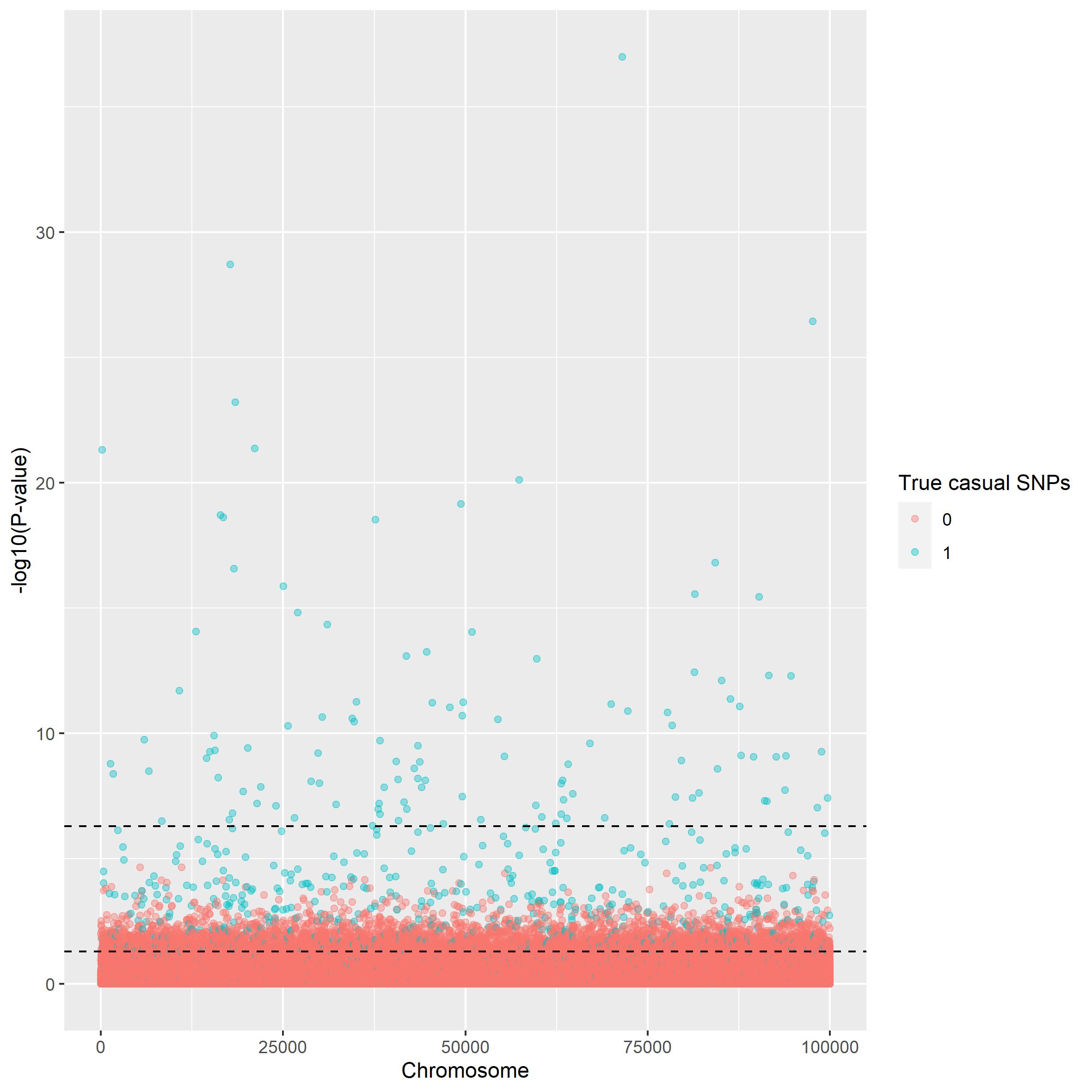
This can also be illustrated using a scatterplot.
scatter_plot(gwas_summary, beta)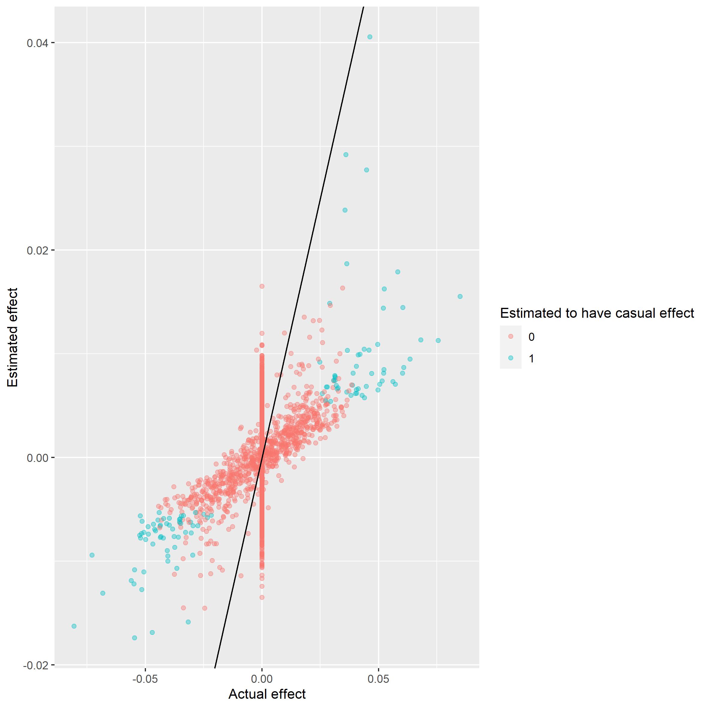
It seems the most extreme cases are caught. The next plot shows that we do not have the power to catch the less extreme cases.
power_plot(gwas_summary, beta) 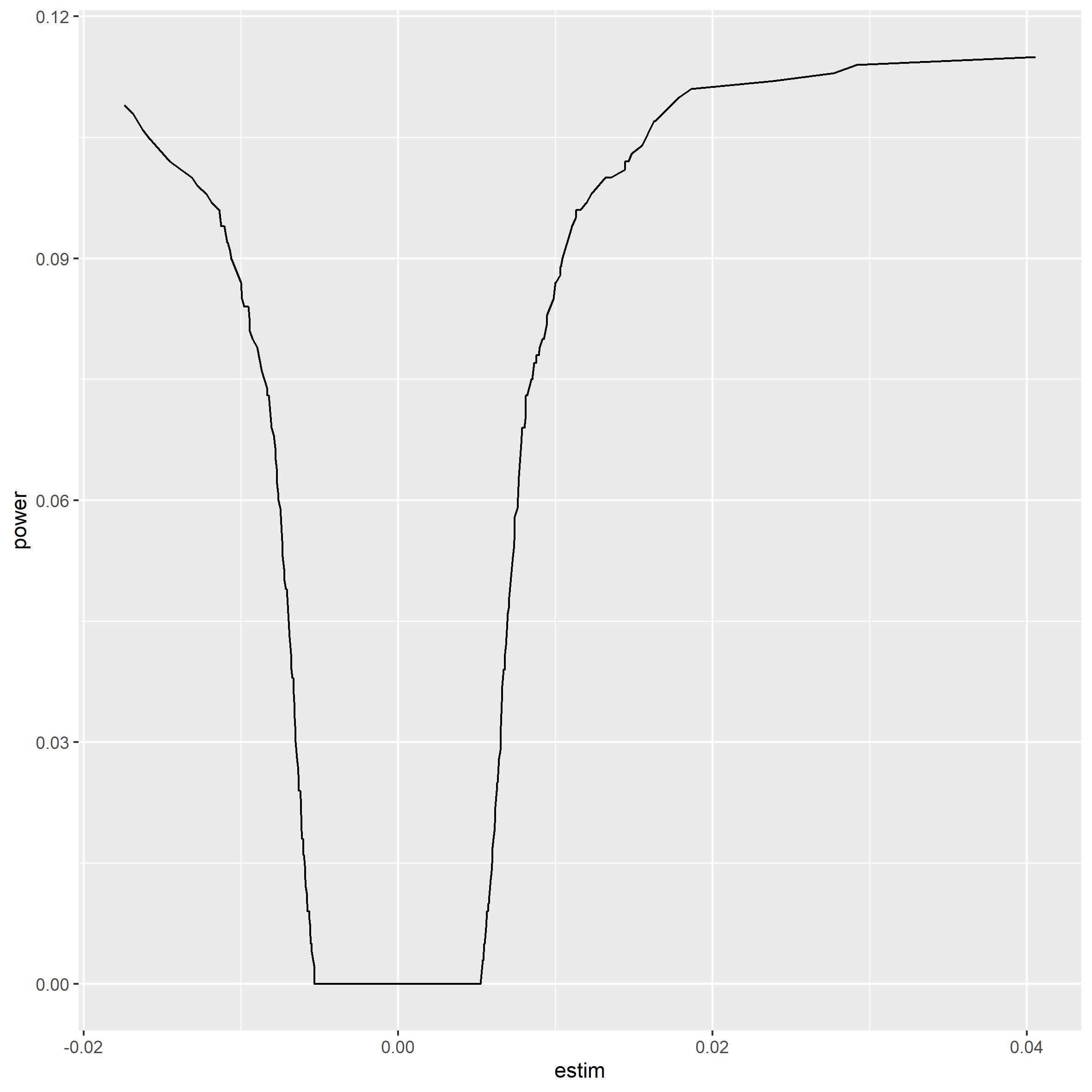
Logistic regression
Since our target variable is binary it would seem reasonable to run logistic regression instead of linear. The plots have been run on the same dataset as above.
gwaslog_summary = GWAS(G=G, y=y[[1]], p=5e-6, logreg = TRUE, ncores=3)
knitr::kable(gwaslog_summary[1:10,], digits = 2, align = "c")| estim | std.err | niter | score | p_vals | causal_estimate |
|---|---|---|---|---|---|
| -0.14 | 0.10 | 4 | -1.35 | 0.18 | 0 |
| -0.15 | 0.08 | 4 | -1.88 | 0.06 | 0 |
| -0.24 | 0.18 | 5 | -1.30 | 0.19 | 0 |
| -0.06 | 0.09 | 4 | -0.67 | 0.50 | 0 |
| -0.09 | 0.08 | 4 | -1.14 | 0.25 | 0 |
| 0.11 | 0.19 | 4 | 0.59 | 0.55 | 0 |
| 0.07 | 0.08 | 4 | 0.88 | 0.38 | 0 |
| -0.02 | 0.10 | 4 | -0.25 | 0.80 | 0 |
| 0.12 | 0.08 | 4 | 1.55 | 0.12 | 0 |
| 0.00 | 0.09 | 3 | -0.03 | 0.97 | 0 |
To check the perfomance we use the same method as above.
manhattan_plot(gwaslog_summary, beta, thresholds = c(5e-7, 0.05))
power_plot(gwas_summary, beta) Here the scatterplot has not
been used since the estimates from a logistic regression is not directly
comparable to the actual values. There is no noticeable difference in
the manhattan plots, but from the power plots however the logistic
regression seems weaker. But both of these methods are outperformed by
Here the scatterplot has not
been used since the estimates from a logistic regression is not directly
comparable to the actual values. There is no noticeable difference in
the manhattan plots, but from the power plots however the logistic
regression seems weaker. But both of these methods are outperformed by
vignette("LT-FH"). To see more documentation about the
difference in performance between the association methods described see
vignette("Comparison between GWAS and LT-FH").