Comparison between GWAS and LT-FH
Comparison.RmdWe will in the this vignette provide visual comparison between GWAS,
GWAS using logistic regression and LT-FH. We load the \(10^4 \times 10^4\) data, but the following
plots have been evaluated on \(10^5 \times
10^5\) data. Just like vignette('GWAS') and
vignette('LT-FH').
Confusion matrices
data = snp_attach('genetic_data.rds')
data_ltfh = LTFH(data = data, n_sib = 2, K = 0.05, h2 = 0.5)
gwas_summary <- GWAS(G = data$genotypes, y = data$fam$pheno_0, p = 5e-7)
#> Warning: 'y.train' is composed of only two different levels.
gwaslog_summary <- GWAS(G = data$genotypes, y = data$fam$pheno_0, logreg = TRUE, p = 5e-7)
#> For 1 columns, IRLS didn't converge; `glm` was used instead.
gwas_LTFH <- GWAS(G = data$genotypes, y = data_ltfh$l_g_est_0, p = 5e-7)
true_causal = (data$map$beta != 0) - 0
causal <- tibble(causal_gwas = gwas_summary$causal_estimate,
                 causal_gwaslog = gwaslog_summary$causal_estimate,
                 causal_gwasLTFH = gwas_LTFH$causal_estimate)

df <- causal %>%
  pivot_longer(cols = everything(), names_to = "method") %>%
  group_by(method) %>%
  summarise("11" = sum(value == 1 & true_causal == 1),
            "10" = sum(value == 1 & true_causal == 0),
            "01" = sum(value == 0 & true_causal == 1),
            "00" = sum(value == 0 & true_causal == 0)) %>%
  pivot_longer(cols = !method) %>% group_by(method) %>%
  mutate(
    'Prediction' = as.character(c(1,1,0,0)),
    'Actual' =  as.character(c(1, 0, 1, 0)))
#> `summarise()` ungrouping output (override with `.groups` argument)


df %>%
  ggplot(aes(x = Actual, y = Prediction)) +
  geom_tile(aes(fill = value), colour = "white", show.legend = FALSE) +
  geom_text(ggplot2::aes(label = sprintf("%1.0f", value)), vjust = 1) +
  scale_fill_gradient(high = "firebrick", low = 'dodgerblue3', trans='pseudo_log') +
  facet_wrap(~method)
knitr::include_graphics("confusion_comparison.jpg")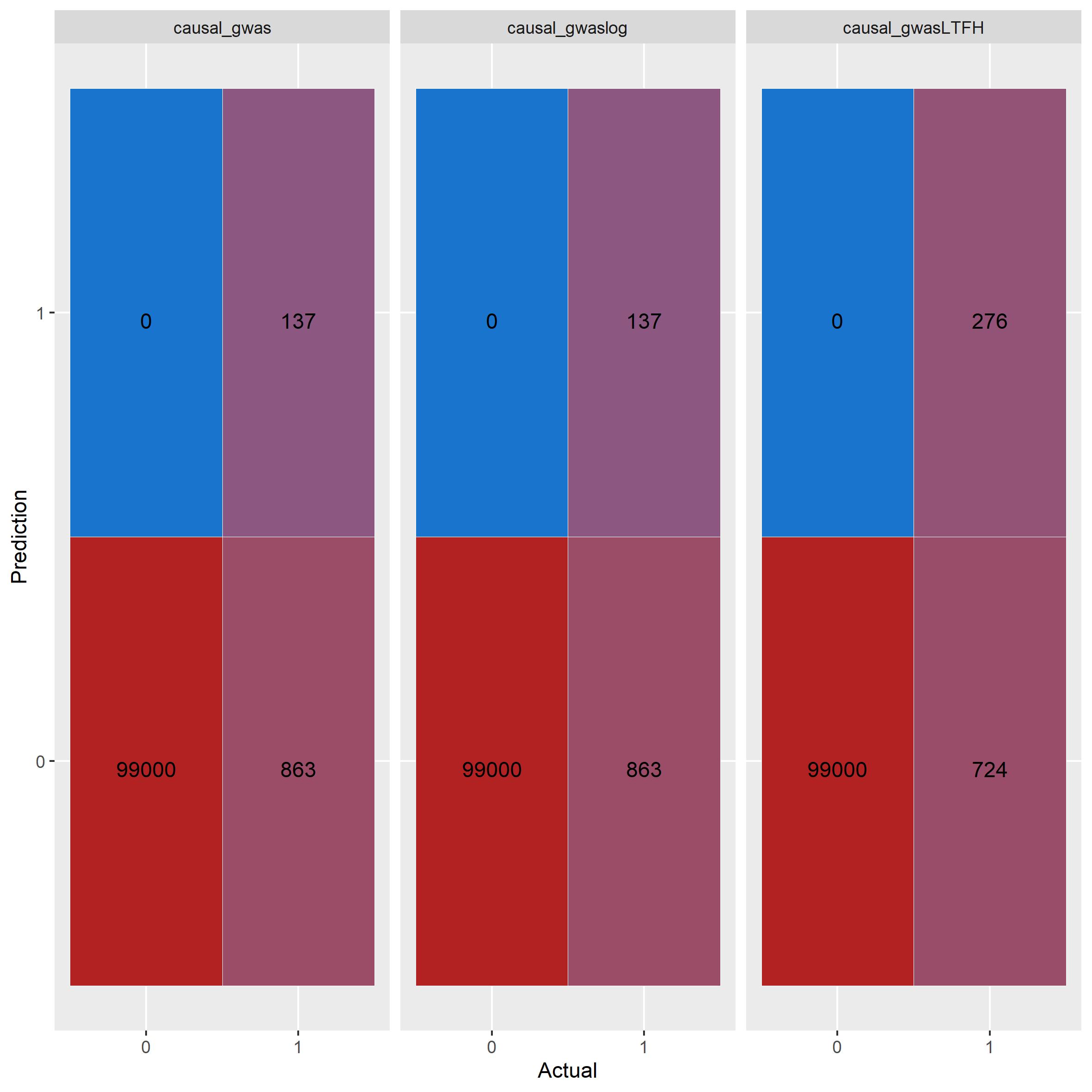 GWAS using linear
regression and logistic regression performs exactly the same. LT-FH
outperforms both correctly idenftifies twice the amount of causal
SNPs.
GWAS using linear
regression and logistic regression performs exactly the same. LT-FH
outperforms both correctly idenftifies twice the amount of causal
SNPs.
Plots
Power plot
beta = data$map$beta
gwas_df = gwas_summary %>%
mutate(true_causal = (beta != 0) - 0) %>%
filter(true_causal == 1) %>%
arrange(abs(estim)) %>%
mutate(power = cumsum(causal_estimate)/sum(true_causal), Method='GWAS') %>%
select(estim, power, Method)
gwaslog_df = gwaslog_summary %>%
mutate(true_causal = (beta != 0) - 0) %>%
filter(true_causal == 1) %>%
arrange(abs(estim)) %>%
mutate(power = cumsum(causal_estimate)/sum(true_causal), Method='GWASlog') %>%
select(estim, power, Method)
ltfh_df = gwas_LTFH %>%
mutate(true_causal = (beta != 0) - 0) %>%
filter(true_causal == 1) %>%
arrange(abs(estim)) %>%
mutate(power = cumsum(causal_estimate)/sum(true_causal), Method='LT-FH') %>%
select(estim, power, Method)
bind_rows(gwas_df, gwaslog_df, ltfh_df) %>%
ggplot() +
geom_line(aes(x = estim, y = power, color=Method)) +
xlim(-0.3, 0.3)
#> Warning: Removed 30 row(s) containing missing values (geom_path).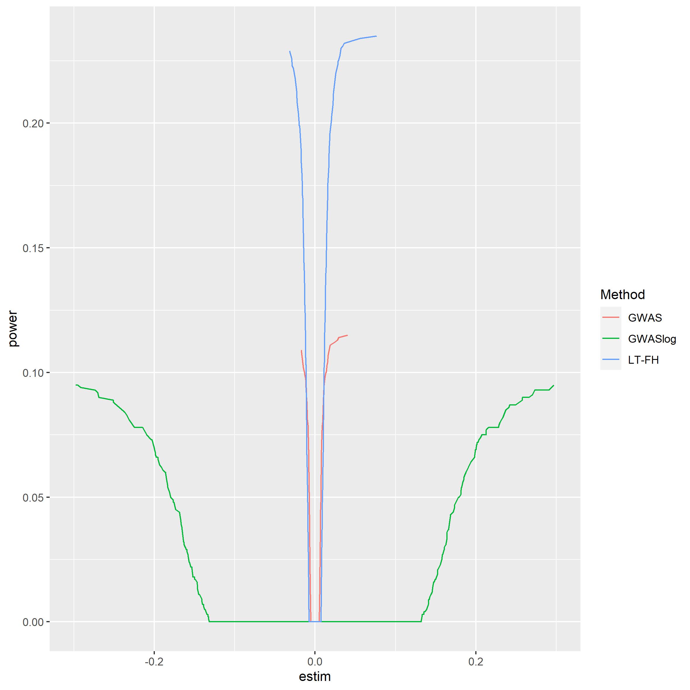 It is clear to see that LTFH is
more powerful than both of the other GWAS methods. Logistic regression
seems quite weak, but this has to be taken with a grain of salt since
the estimates from logistic regression is of another form than linear
regression.
It is clear to see that LTFH is
more powerful than both of the other GWAS methods. Logistic regression
seems quite weak, but this has to be taken with a grain of salt since
the estimates from logistic regression is of another form than linear
regression.
Manhattan plot
plt_gwas_man = manhattan_plot(gwas_summary, beta, thresholds = c(5e-7, 0.05))
plt_log_gwas_man = manhattan_plot(gwaslog_summary, beta, thresholds = c(5e-7, 0.05))
plt_ltfh_man = manhattan_plot(gwas_LTFH, beta, thresholds = c(5e-7, 0.05))
lgnd_m = cowplot::get_legend(plt_gwas_man + theme(legend.position = "top"))
plt_gwas_man_m = plt_gwas_man + theme(legend.position="none")
plt_log_gwas_man_m = plt_log_gwas_man + theme(legend.position="none")
plt_ltfh_man_m = plt_ltfh_man + theme(legend.position="none")
gridExtra::grid.arrange(plt_gwas_man_m,
plt_log_gwas_man_m,
plt_ltfh_man_m,
lgnd_m,
ncol=3,
nrow=2,
layout_matrix = rbind(c(1,2, 3), c(4,4,4)),
widths = c(4, 4, 4),
heights = c(5, 0.5),
top = c("Manhattan plots for GWAS, GWAS using logistic regression, and LT-FH"))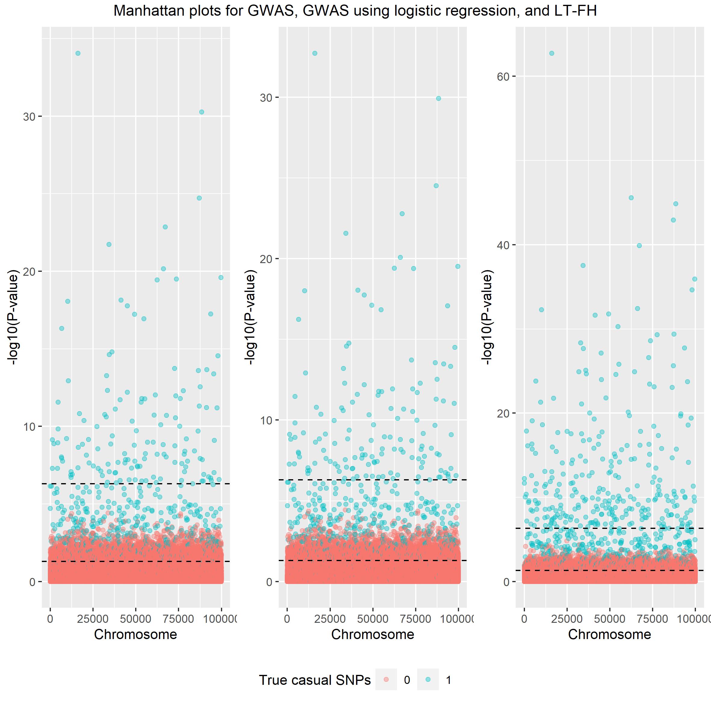 Again both linear and logistic
regression seem very alike and LT-FH outperforms both.
Again both linear and logistic
regression seem very alike and LT-FH outperforms both.
Scatter plot
plt_gwas_scat = scatter_plot(gwas_summary, beta)
plt_ltfh_scat = scatter_plot(gwas_LTFH, beta)
lgnd_s = cowplot::get_legend(plt_gwas_scat + theme(legend.position = "top"))
plt_gwas_scat_s = plt_gwas_scat + theme(legend.position="none")
plt_ltfh_scat_s = plt_ltfh_scat + theme(legend.position="none")
gridExtra::grid.arrange(plt_gwas_scat_s,
plt_ltfh_scat_s,
lgnd_m,
ncol=2,
nrow=2,
layout_matrix = rbind(c(1,2), c(3,3)),
widths = c(4, 4),
heights = c(5, 0.5),
top = c("Scatter plots for GWAS and LT-FH"))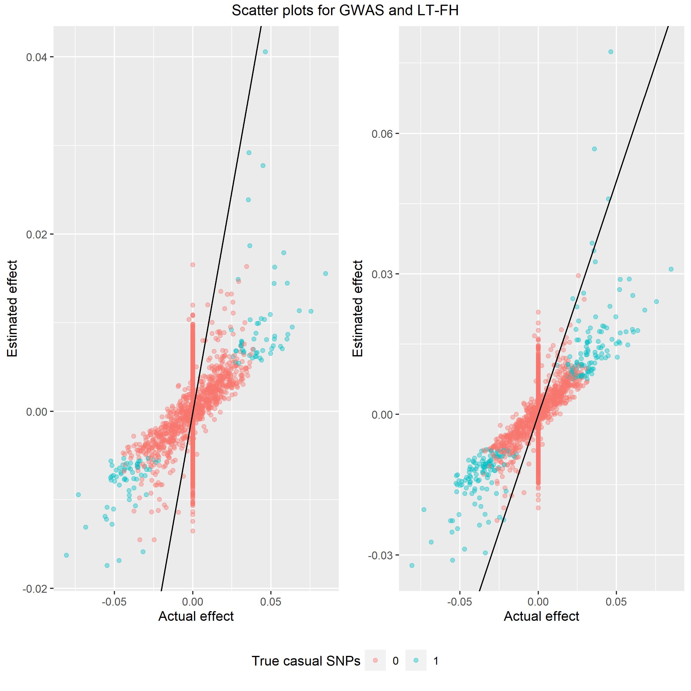 Again we would like the spread
of data to be around the identity line and from these plot LT-FH is
closer to the line than GWAS.
Again we would like the spread
of data to be around the identity line and from these plot LT-FH is
closer to the line than GWAS.